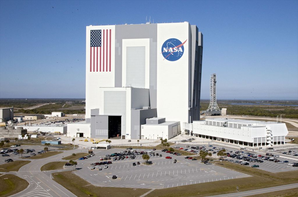
For the first logo in this series of blogs we’re aiming high, and I mean high, all the way to far side of the moon high. I want to talk about a logo that has more history and legend attached to it than any other piece of graphic design. It’s affectionately referred to as the ‘Meatball’ and first entered popular culture in 1959 as the logo for the newly formed National Aeronautics and Space Administration more commonly known as NASA.
The ‘Meatball’ was designed by NASA employee James Modarelli at the Lewis Research Centre. He took the official agency seal and simplified it keeping only some elements and placing the now famous acronym, NASA, at its centre.
Now we have the history out the way, I want to tell you why I love this logo and why it’s on my list of all-time favourite logos.
I am a space nerd
Anyone who knows me knows I am a space nerd (he says looking at the NASA water bottle and Saturn V rocket model peeking out from behind his monitor). This fact alone would make me put this logo in my all-time favourite list, but the design is just perfection, using only three colours and a perfect balance of visual elements that tell you what and who it represents. There’s a simplicity to it, but there’s a strength in that simplicity and it’s so perfectly self-contained in its circular form that it has a boldness to it.
this was a logo designed to be a rallying point of America
It doesn’t take much research to understand the use of bright red, deep blue and crisp white in the colour palette giving that this logo was designed in an age of great American patriotism. Afterall this was a logo designed to be a rallying point of American and western ambition and technical achievement in an age of proving superiority over the Soviet Union and its communist system. The meatball captured that sense of ambition so perfectly and even with its jingoistic undertones it still managed to capture that pursuit of human achievement of looking beyond our world. The red vector, representing aeronautics, points upwards to the stars giving that sense of ambition but there is a delicacy to this shape. There would have been temptation to make this shape more angular, but the curves add something more romantic to the logo, something more organic and stays clear of a militaristic aesthetic (NASA is and always has been a civilian agency). The circular line, representing a spacecraft in orbit, ties the letters and the vector together as it swirls around them both clearly illustrating the goal of the organisation it represents. The field of stars in the background gives everything context, that feeling of looking toward the final frontier and of humanities biggest adventure beyond our planet. Even the font used for the lettering works, the bold serif font draws the eye but somehow doesn’t dominate the other elements sitting naturally within the design.

incredibly recognisable and evocative
The NASA logo is a lesson in simple bold design that quickly tell us who and what it represents. It is timeless and sits among only a few organisations who have never had to redesign their logos.
But flowery descriptive words out the way let’s face it, it’s just a cool logo; great colours, bold shapes and a simple elegant design that tells you exactly who and what NASA is. it never seems to matter where it appears, or on what background or location or medium, somehow the NASA logo draws the attention. It’s a timeless piece of design that has survived throughout the decades, remaining incredibly recognisable and evocative and I love it. God speed Meatball may you forever inspire the imaginations of future explorers.
